Designing for activity

An example of UX transformation, with before / after comparison
Project Overview
This was part of a complete overhaul of the main company's platform.
Stakes were high with most of the turnover depending on that platform.

I will focus on the UI / UX part, not the technical and regulatory transformation of the project.
Context
Patients in hospital and clinics came to a booth to open up TV and WiFi rights in their room and for their devices.
A salesperson from the company or a third party would greet them, register their room, dates of their stay and what offer they wanted.

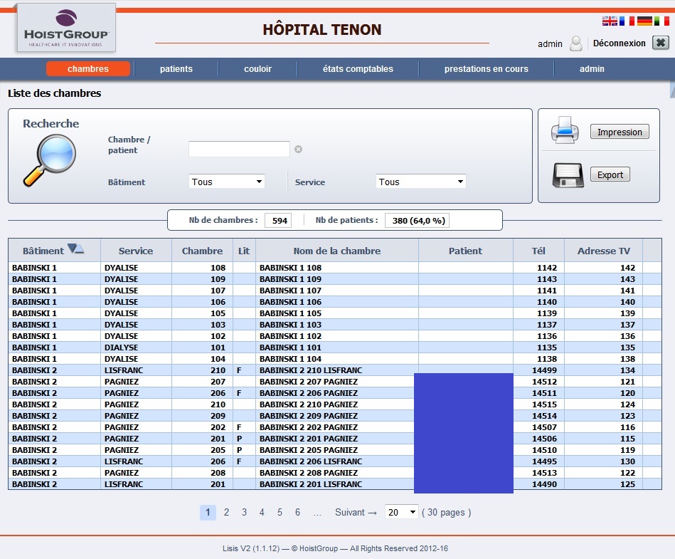
The "before" version is shown below.
This did not support the activity of the salesperson using the software.
It is a representation of the technical side : a database of rooms and patients one can search through and act upon.

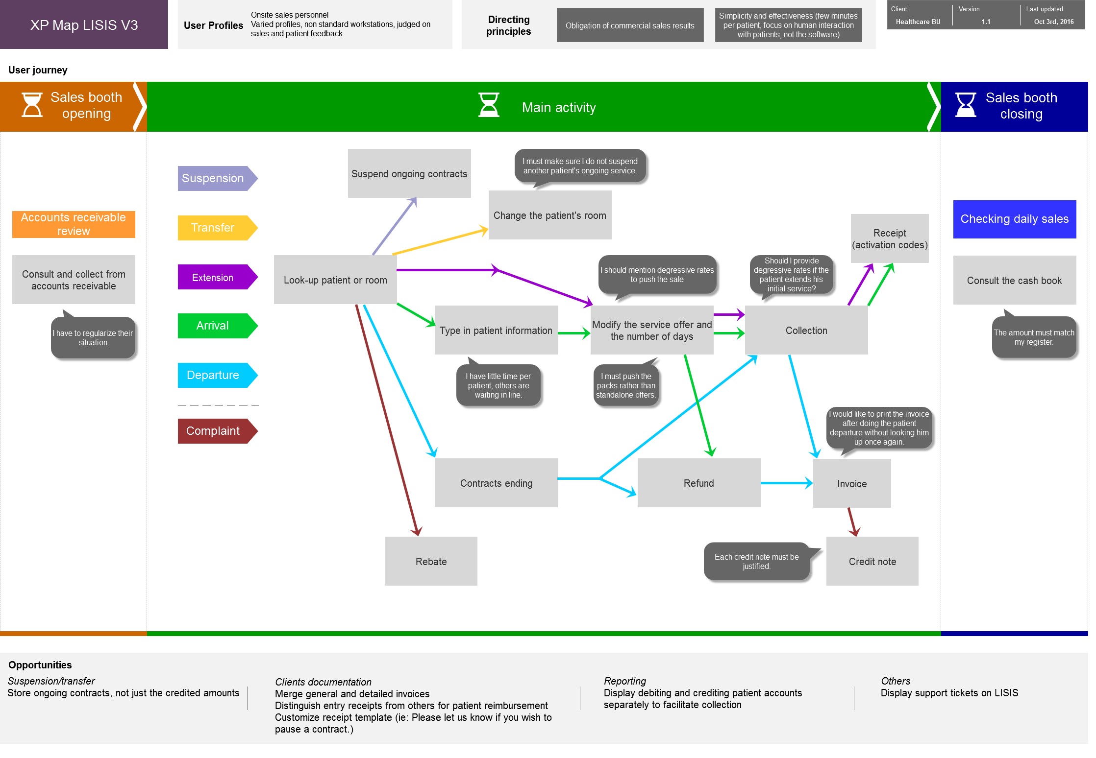
User research resulted in a User Journey Map.
More info on this page
It showed that the activity of salespeople was to control their daily revenue, upsell (push premium, packs and offers for a longer stay), handle / log complaints, generate invoices, block a service if unpaid, etc.
This was a far more complex activity with a critical incentive : their bonus depended on their sales, and sales depended on the quality of interaction with patients.

‍
Issues with that design
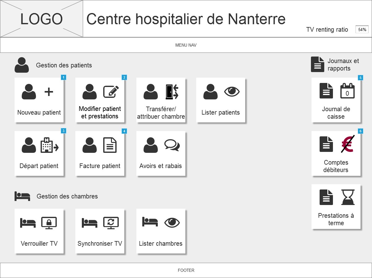
Armed with those insights, we built wireframes supporting that activity. It resulted in simple buttons depicting the activity, so users could easily perform tasks without mobilizing cognitive resources on the software and focus on the interpersonal interaction with patients.
‍
Wireframes were quickly developed with Axure. Some of the key features were prototyped to show complete processes.
The wireframes and prototypes were tested and validated iteratively, then became part of the product specifications and turned to engineering for development.

‍
From a map to a product
The final product was successfully deployed all over France, and users welcomed and adopted the new product unanimously.

One small feature was forgotten in the new version : experts used the tab key to navigate quickly within a patient's form.
With a feedback loop in place, the feature was quickly added again.

‍
Final product